
Where we are.
Fig 1
Fig 1 shows the historic growth of varying sources of energy with lines that show what the energy production would be if the rate of growth continued for a further two decades.
Note that these charts show projections, not predictions.
This projection shows that we are on track to generating energy at a rate that matches the projected demand.
Fig 2
Fig 2 shows the projected proportions of energy sources.
We see that going beyond the year of match the trend is that solar energy is the most significant.
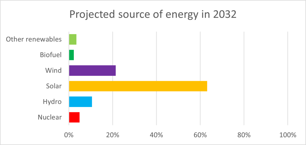
Illustration : Fig 3
Fig 3